
An MSForms (all VBA) treeview
Pages in this article
Features
Performance
Realistically a VBA form with all the controls we need for each node can’t be expected to match that of the compiled original. Even so we are surprised at what has been possible, albeit with considerable tuning and refining. Light testing suggests 1000 to 2000 nodes is quite feasible even in a typical five year old laptop, depending on the configuration of the treeview.
Cosmetics
The original has a wide variety of features and functionality. We have tried to replicate most of these, and added a few features of our own.
Checkboxes
The common controls treeview has a checkboxes option so you can check nodes. We ensured our treeview has that too.
A picture says more than a thousand words, so:
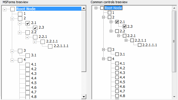
Checkboxes are possible and work!
Expand/collapse boxes or icons
By default we draw a rectangle with a plus or minus characters as text to mimic the expand/collapse boxes. You can also opt for expand/collapse icons. We have bundled XP and Win7 style expander icons in the demo form or you can customize your own as you wish:
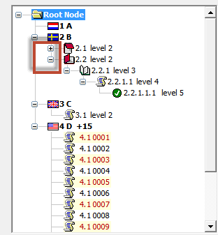
Icons as expand/collapse buttons
Lines
The treeview from the common controls lib always shows lines to indicate the structure. With ours it is optional to show lines. The choice might be for aesthetic reasons, however a very large treeview will load significantly faster without lines so that might be an overriding consideration.
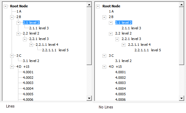
Choose whether or not to show lines
Icons
Again, let's just look at the picture!
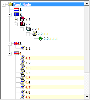
You can add icons too!
If you are familiar with the ImageList control we have incorporated a similar approach. You can store your images in a (hidden) frame and pass a reference to the frame, just as you would pass a reference to an ImageList to the common controls treeview. However your icon images could be stored anywhere. As long as you can retrieve a “StdPicture” handle for each icon and add it to a “collection” that’s all we need.
Label formatting
Label formatting is available to you with code as simple as:
cNode.BackColor = RGB(255, 255, 220) ' pale yellow
cNode.ForeColor = RGB(180, 0, 0) ' dark red
Make sure you do not use code like:
When you are building the set of nodes, the controls of the treeview have not yet been created (this is done when .Refresh is called). Using the properties the node class itself exposes ensures those are applied when the nodes are created. Only once the treeview is fully initialised and refreshed you can access the properties of the cNode.Control.
In addition, the treeview will automatically pick up the default font settings of its parent (frame) control, so controlling appearance of the treeview starts as easy as setting properties of the frame you'll use to host the treeview. I'll explain this on the next page.
Functionality
We've already implemented quite some functionality. Here is what you can do "out of the box":
Collapsing and expanding
Clicking the expand/collapse buttons does as advertised: it expands or collapses the tree.
Navigation using mouse and keyboard
Navigation using mouse and keyboard works just like in the "old" treeview. Right and left arrow expand or collapse, up and down arrow move up or down the tree. Page-up and down just work.
Editing nodes
You can use F2 to edit a node. Double-clicking a node also puts it in edit mode. This option can be enabled or disabled by setting a property value.
Drag and drop
We're working on that.
Copying, moving (cutting) and pasting
Copy and move functions are built in, you can copy or move single nodes or entire branches. You can do that silently but we have also made it easy for you to trap user actions on the selected node, eg Ctrl-c, Ctrl-x, Ctrl-v. You can include your own code to validate the intended actions, eg only allow copy between similar levels, then instigate the copy or move.
Sort
An efficient sort routine has been devised especially for this treeview. Currently it only operates at a given node level, however options for sort order and text/binary are included.
Properties
There is quite a number of properties you can change. To give you an idea, some are listed below. There are more properties and methods, which are documented in the Excel download.
Full Width
True: Node caption widths extend beyond the width of
the treeview, makes for clear highlighting of the
selected node and if backcolor's are applied.
False: label widths are 'autosized' to the text
If node icons are used an additional image control is
created for use with 'full width'
A large tree using node icons will load faster if 'full width' is not applied.
NarratorReaderControl
To make sure the treeview works well with Windows Narrator and hence addresses the needs of the visually impaired, we've added this option as of version 26.5 (set to True by default). Set to True to make sure the active node is picked up by screen reader software.
Checkboxes
True: show checkboxes.
Press spacekey or click to change the value.
The check change event is trapped in the form, and the info label updated.
Allow Editing
User can manually edit the node.
Double click or press F2 on a selected node.
Key Enter to apply the edit or Esc to abort.
Show Lines
Whether or not to show lines may be a matter of
aesthetics or needs depending on the tree.
Try experimenting with different indentation widths (see
the spin button).
In a large tree start-up time will be considerably faster if lines are not shown.
Root button
True: the entire tree can be collapsed to the Root.
False: the tree can only be collapsed to the first
level.
Expander icons
The expander buttons can be Labels with +/-
characters toggled, or pairs of icons.
If icons are used the images must be available in the
workbook, on a sheet or as in the demo hidden on the
form.
The demo includes pseudo WinXP and Win7 Explorer type expander icons, but you can use any icons of your choice, or no icons.
Indentation
Default is 15 points
NodeHeight
The treeview already automatically adjusts its Node height to the Font size or checkbox size or Icon size, whichever is the larger.
It's probably best not to adjust Node height.
Font size
The font size and other default label properties are adopted from the parent frame.
Change at design time only.
RootNodes
Nodes
Methods
ActivateNode
Copy
Move
NodesClear
NodeRemove
Refresh
SetTreeExpansionLevel
TerminateTree
ScrollToView
Events
Currently we have made available a limited set of events:
Click event
Fires when you click any node.
Node check event
Fires when you click the checkbox of a node.
After label edit event
Fires after editing a label.
Key down event
Fires when you press a key. The demoform included in the sample project shows how to implement copy and paste.
Mouse events
All mouse events are pushed through using a single MouseEvents event.
Add your own events
It isn't hard to add your own events, e.g. it takes three steps to add a new event for a specific element of the tree:
- Add event to the clsNode class for the piece of the tree you need an event for, by using the dropdowns at the top of the code window. Make sure it then calls a Friend sub in the clsTreeView class.
- Add an Event declaration to the clsTreeView class (like shown above) and a friend sub that raises that event when called from clsNode.
- Add an event handler to your userform.
Next: using this treeview in your VBA project.

Comments
Showing last 8 comments of 78 in total (Show All Comments):Comment by: Peter Thornton (27-9-2021 10:33:00) deeplink to this comment
Hi Mark,
You can adapt the code to include the double click event if you follow the comments starting under if you follow the comments starting under 'Event Click', near the top of clsTreeview. Then it's fairly straightforward to include the code to toggle expand/collapse in the event, either in your project or within the treeview classes.
FYI the pro version includes an optional property 'DblClickExpand' which does exactly what you ask, also the full range of events and much else.
Comment by: Mark C (8-10-2021 02:17:00) deeplink to this comment
Hi Peter,
Thank you for the instruction. :)
I notice there might be a bug with modal popup form.
With demo access file you provided,
1. creat frm01, set as pop up form, and modal mode as true
2. add a button on frm01, simply use it add code "DoCmd.OpenForm "frmDemo"
3. Open frm01 and click the button to open frmDemo; close frmDemo, and the whole access program will be minimized. It should just close frmDemo and leave frm01 on screen.
4. To advoid it, set frm01 modal mode as false; Or just delete subTreeView control from frmdemo.
I dont' know what is causing the problem. Could you have a check?
Thanks,
Comment by: Peter Thornton (8-10-2021 12:09:00) deeplink to this comment
Hi Mark,
I can reproduce what you describe, I'm not sure why that occurs either.
However this does not seem to occur with the 'pro' treeview, so it might be related to how the 'userform' is handled which is much improved in the pro version.
You are the first person in 8 years to notice this:)
Comment by: john bourne (8-1-2024 17:24:00) deeplink to this comment
I am using this in an application and it has fulfilled all my requirements.
Is there any print function/report?
Comment by: Jan Karel Pieterse (9-1-2024 10:10:00) deeplink to this comment
Hi John,
I'm afraid you will have to write your own printing routine :-)
Comment by: Steve (16-5-2024 00:03:00) deeplink to this comment
I would like to be able to turn off the checkboxes for certain levels of the tree. For example, I'd like checkboxes only for the lowest children. Is it possible to do this?
Comment by: Jan Karel Pieterse (16-5-2024 15:48:00) deeplink to this comment
Hi Steve,
You would have to modify the classes in the project to make that happen I'm afraid. Currently checkboxes are "all or nothing"
Comment by: Peter Thornton (20-5-2024 14:29:00) deeplink to this comment
Steve, FYI the Pro-Treeview has the option to apply checkboxes selectively. For example only show checkboxes on 'leaf' nodes, if that's what you mean by "...only for the lowest children".
Have a question, comment or suggestion? Then please use this form.
If your question is not directly related to this web page, but rather a more general "How do I do this" Excel question, then I advise you to ask your question here: www.eileenslounge.com.